Scope of Work
Agency
In Good Co.
About the project
In Good Co. reached out to me to reimagine the e-commerce experience for BeautyGrass, a CBD and skincare brand based in LA. They had recently completed a rebrand for the company and were ready to extend the newly developed brand experience to their online store.
Highlights
- Bold and colourful meets clean and elevated
- An ingredient-focussed customer journey
- Custom ingredients page
- Subscription app integration


Project Brief
- Restructure the site, specifically key pages such as the homepage and product pages, to be more intentional, based on the BeautyGrass user journey and best practices in e-commerce
- Highlight the importance of clean, high quality ingredients, which is one of the brand’s core values and USPs, across the site
- Integrate the new branding into the site visuals. Create a site that feels clean and cohesive, while also reflecting the brand’s bold and colourful personality. Balance the approachability of the brand with the premium price point of the products.
Process & Solutions
1. Planning and Strategy
The BeautyGrass website was already hosted on Shopify, but had mainly been built using page builders, so the client was looking for an elevated experience that felt intentional and cohesive.
I initially carried out research and created a strategy, working with the client to identify their main customers and explore the user journey. The majority of BeautyGrass sales to this point came through the in-person spa and the lead beautician, Jenny Evans, and we felt it was important to highlight the connection between the online brand and Jenny.
At the same time, we wanted the website to be able to stand alone from the spa and attract customers who might not be familiar with the physical location. As a result, I mapped journeys for both loyal fans of the spa and new customers interested in clean beauty and small batch skincare, and then created site wireframes based on what I’d identified with the client as core information and storytelling that we would want to feature on key landing pages.


2. Design Decisions
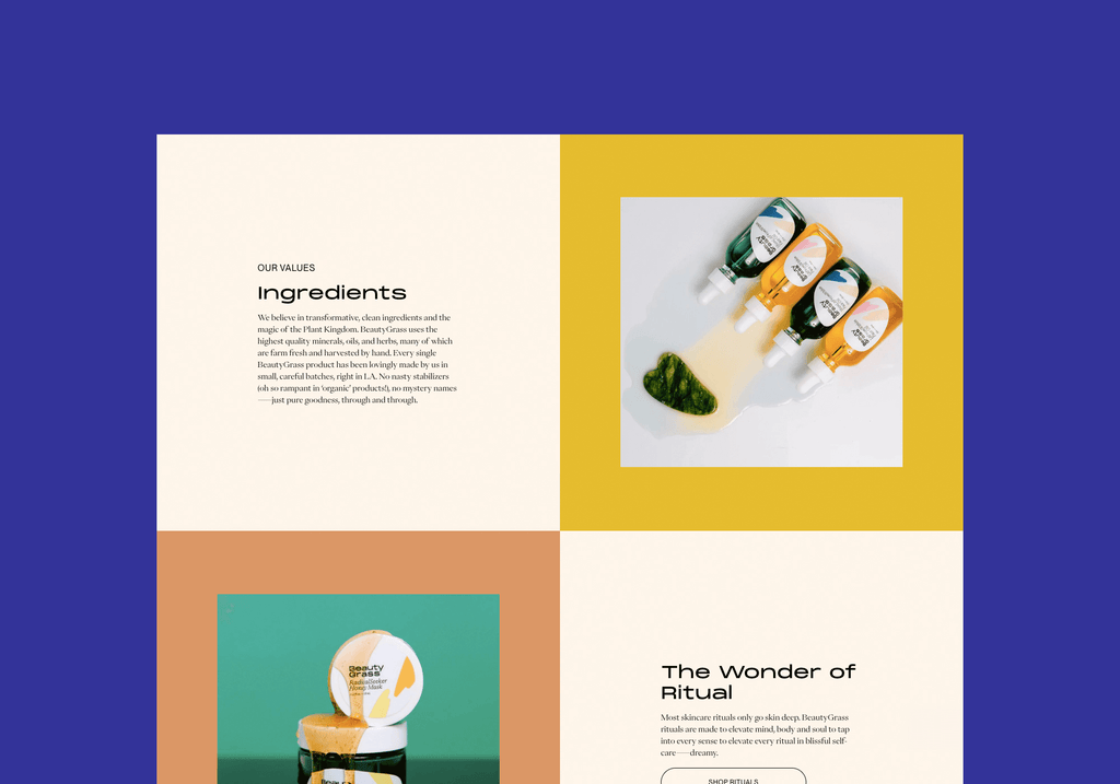
BeautyGrass is a brand with a lot of personality - colourful and bold visual language with a playful and tongue-in-cheek tone of voice. I expressed this by making use of the brand’s extensive colour palette and large bold headings across the site.
At the same time, I kept the use of additional elements, such as patterns and illustrations, to a minimum, so that the site felt clean and elevated, appropriately reflecting the brand’s luxury price point.


3. Ingredients
As the quality of the ingredients is a key differentiator for BeautyGrass, it was very important to weave these through the site. I wanted to create bitesized visual elements that would be easily consumed by browsers of the site, while reinforcing the authority of the brand. I included key ingredients as a featured section on product pages, and built a custom ingredients glossary page. On the product page, I designed the section with the brand’s characteristic bold typeface and large images to make the section visually appealing and easy to scan.
My aim for the custom ingredients page was to create a glossary to house all the ingredients in a way that didn’t feel like an overwhelming amount of information. We created an interactive rollover feature to highlight and present small amounts of information.


4. Development
Taking into account project constraints, such as launch timeline and budget, I implemented an extensive premium theme customisation on Shopify for the BeautyGrass website. I integrated the recharge app to manage (and encourage) subscriptions for repeat product orders.
An important consideration throughout the build was to create a site that was easy for a merchant to update regardless of their technical skill level. I provided personalised tutorials to empower the client to update their site going forward, mitigating the need to hire a developer for small changes.
Credits
BRAND DESIGN / In Good Company